
Client
LinkedIn
Industry
Social Network
Country
Singapore
Art Direction for LinkedIn
Art direction for LinkedIn's APAC GTO Learning Week 2018, an internal team-building and professional development event designed to inspire collaboration, continuous learning, and employee engagement across the Asia-Pacific region. This campaign included developing a cohesive visual identity and event collateral that aligned with LinkedIn's brand guidelines while reflecting the vibrant and engaging experience for LinkedIn's employees.
Logo Design
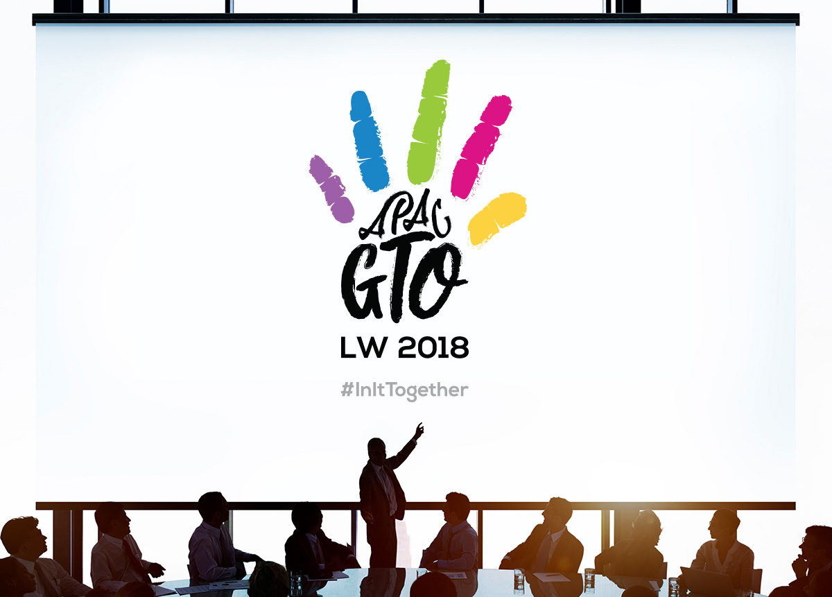
The logo design centres on “child’s play”. Each finger of the hand-drawn hand is of a different colour to represent an individual in a team. Together, these colourful fingers symbolise fun, vibrancy and diversity among collaborative team members. The words “APAC GTO” acts as the supporting palm. Simply put, there is always something new to discover and explore.
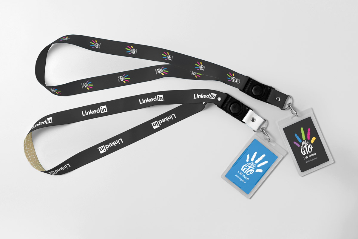
Lanyards
Display Stands

