Client: LinkedIn
Year: 2018
Country: Singapore
LinkedIn is a popular online platform for professional networking with more than 300 million LinkedIn members in over 200 countries.
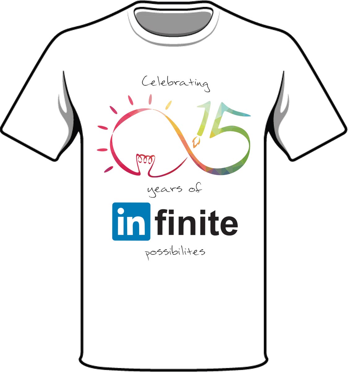
T-Shirt Logo Design
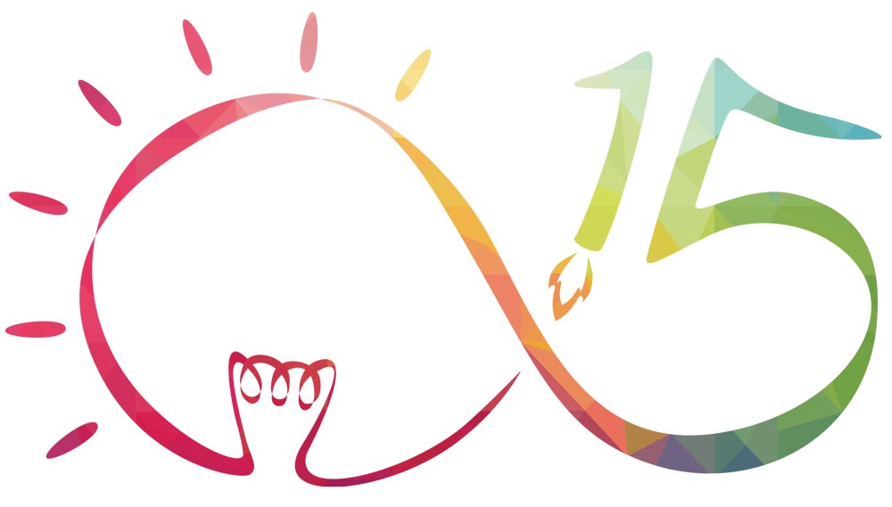
This was a design pitch for LinkedIn’s 15th Anniversary. For this design, what I love most about Linkedin is its belief in the impossible which has provided so many opportunities for professionals from all walks of life. In order to represent this on Linkedin’s 15th anniversary, the number ‘15’ and the light bulb are joined together in a fluid line of the infinity symbol (∞) to signify Linkedin’s global reputation as a key platform for endless business possibilities and sharing of countless innovative ideas between millions of professionals. The ‘1’ of the 15 is portrayed as a rocket which travels in the direction of the infinity to represent Linkedin’s ambition to stay on top of the game from its launch to its future as it continues to expand. The colourful background of geometric patterns* is used to express celebration. The resulting design is simple, classy and most importantly, meaningful.

Logo Design
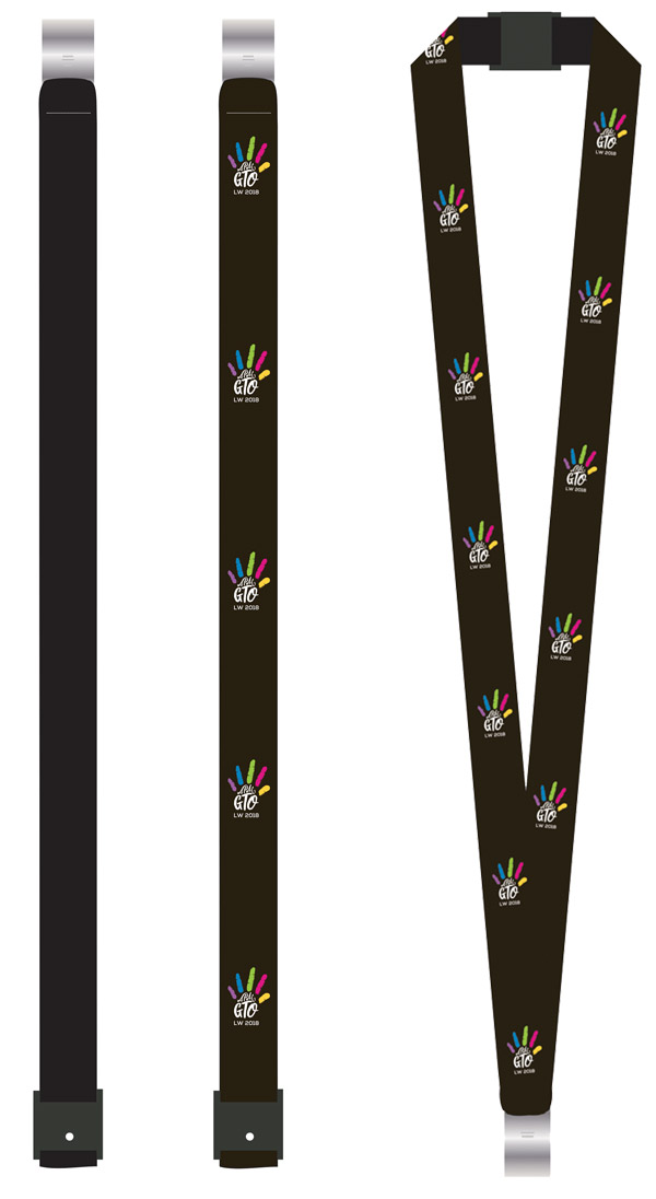
The APAC GTO Learning Week 2018 logo stems from the idea of “child’s play”, the fingers of the hand-drawn hand print is given different colours to represent an individual in a team as well as symbolise fun, vibrancy and collaboration between different team members. The words “APAC GTO” acts as its supporting palm. The idea draws from the fact there is always something to discover and explore in learning.
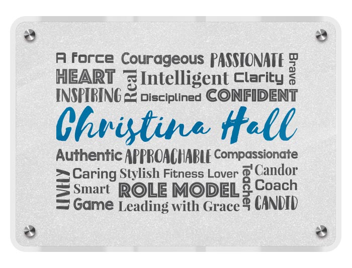
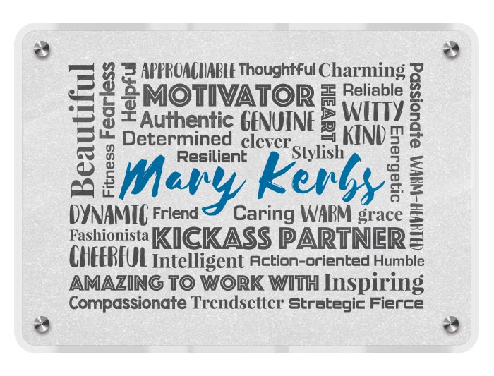
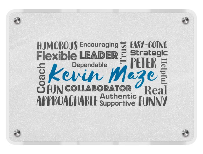
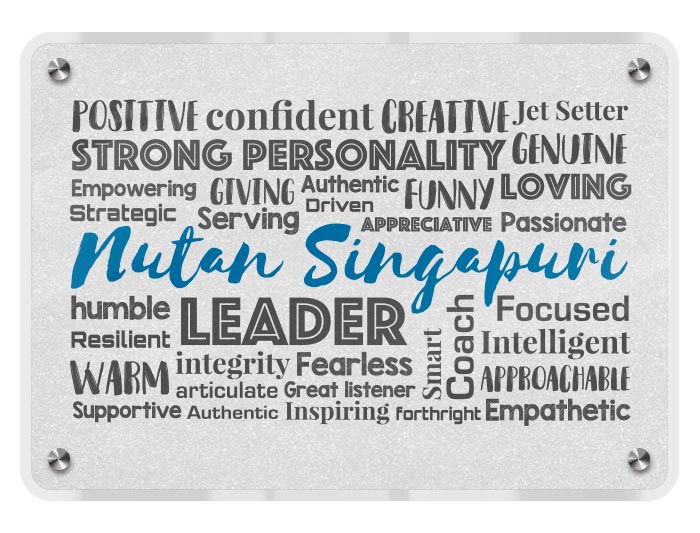
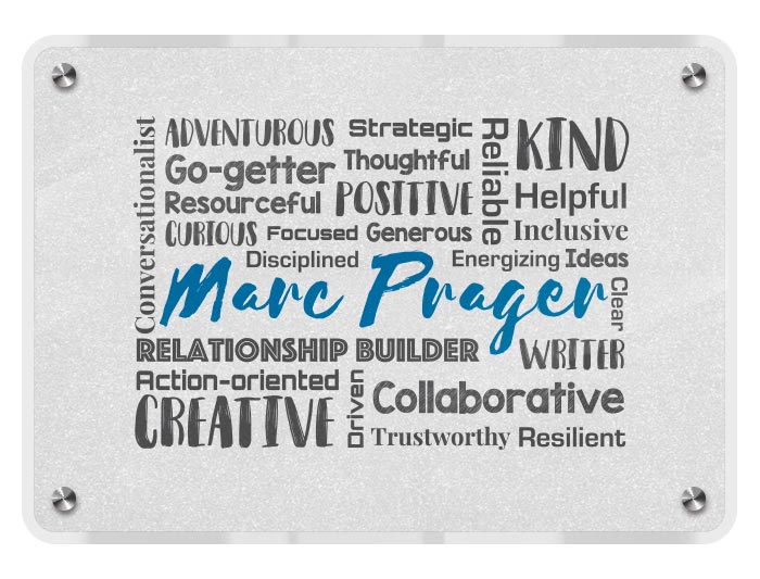
Word Clouds Design
These were designed as awards for outstanding employees in LinkedIn’s Singapore office, using words that describe the personality of each employee in a form of a cloud and framed in acrylic stands.
")
Front
")
Back

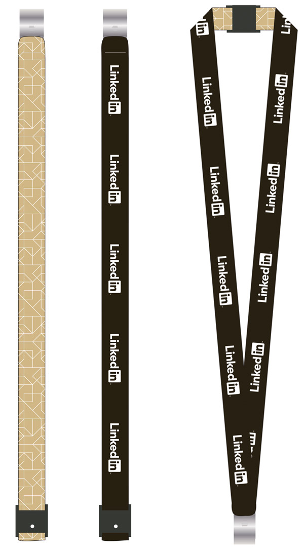
Lanyard Design
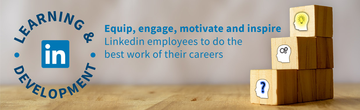
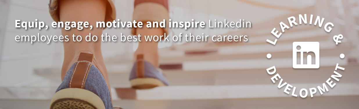
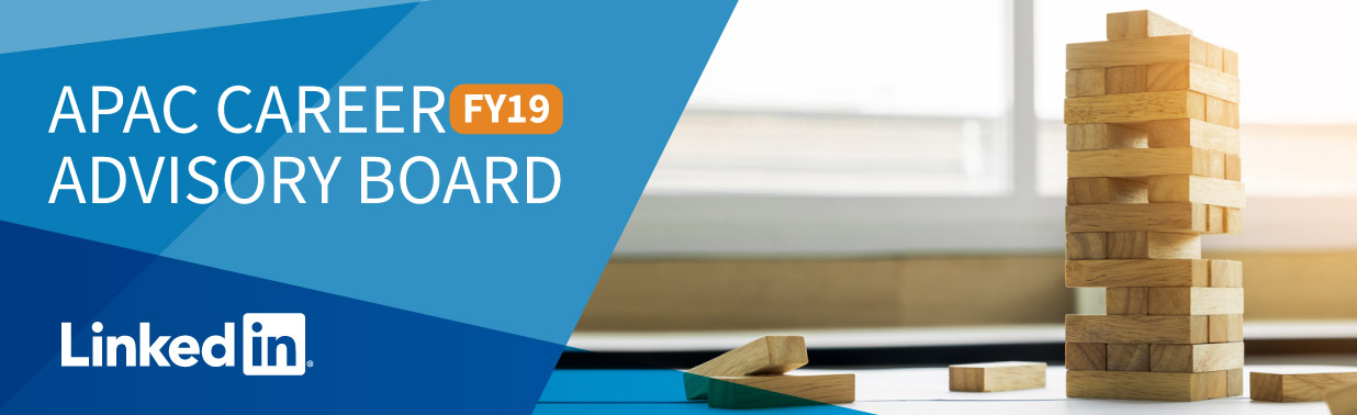
Email Banner Designs


Would you like to work with me?
Feel free to get in touch today.